TAIPA
Branding


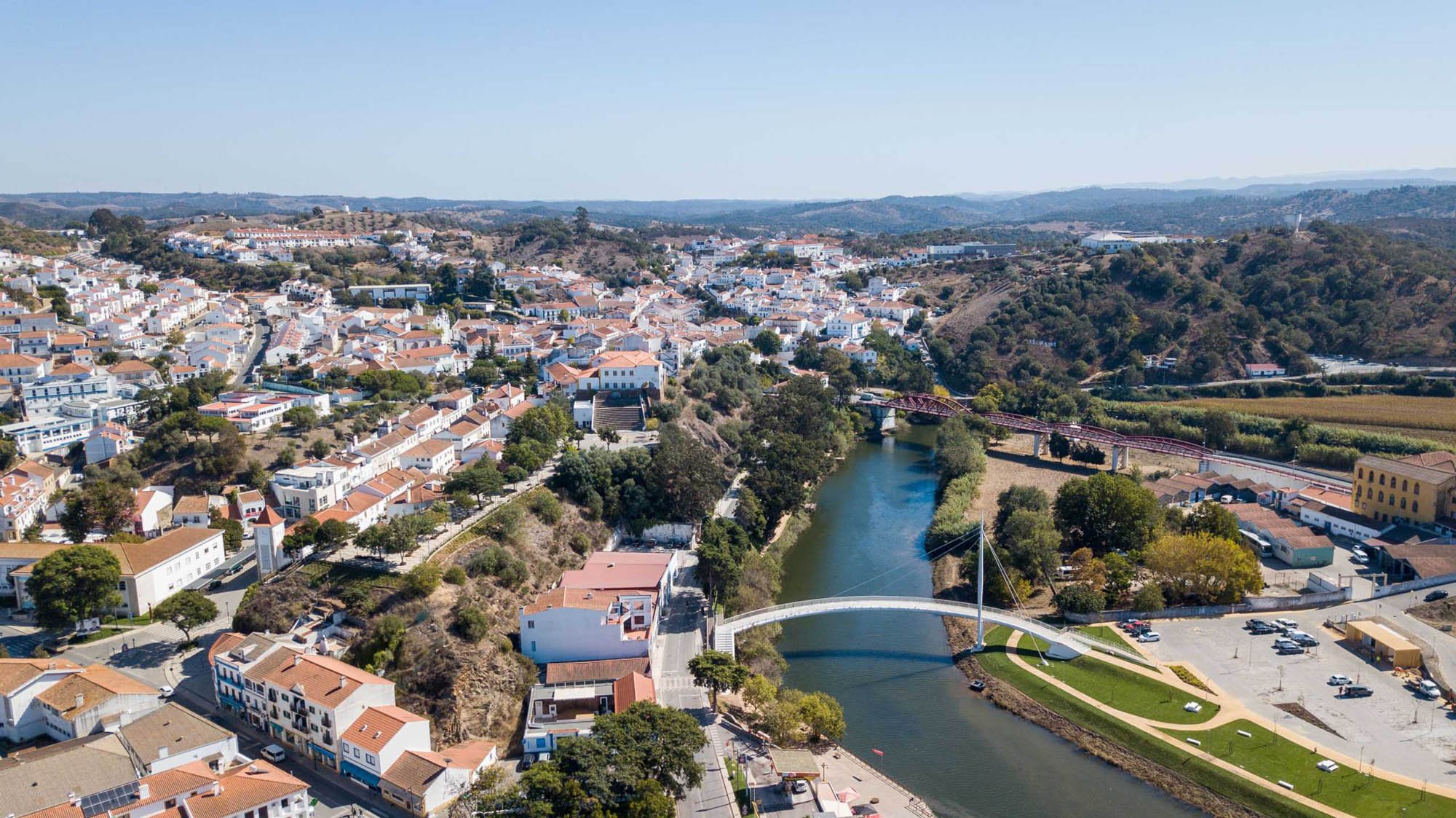
Taipa is an association of social intervention with a presence in the territory for more than 20 years. It is an entity that already has great brand recognition.
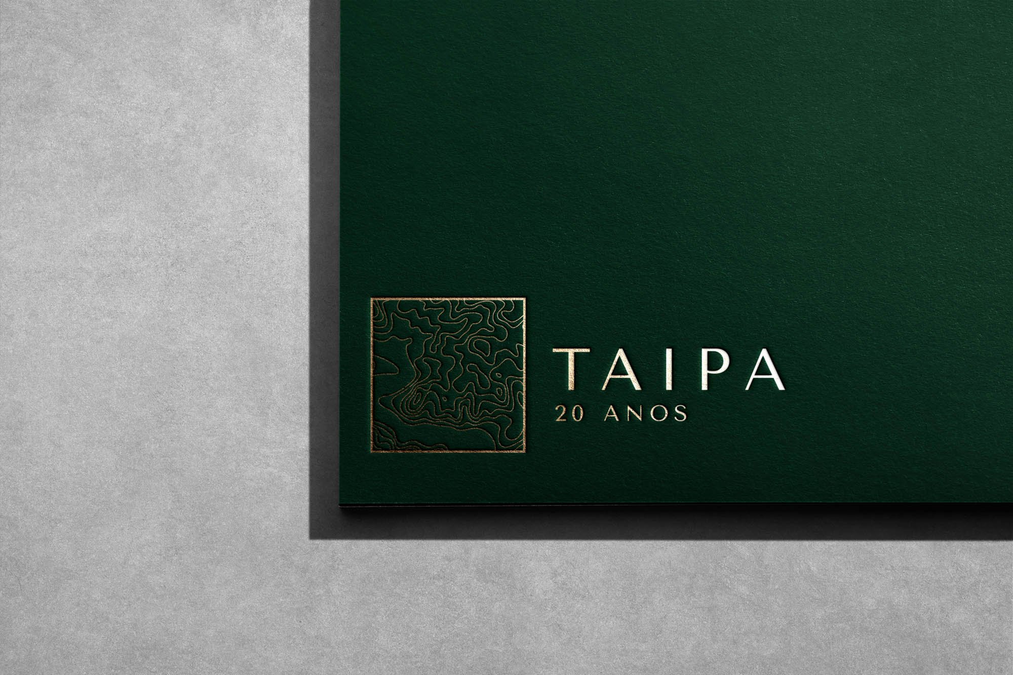
To celebrate its 20 years we created an identity with roots in the territory, just like the association. The organic lines are actually based on the topographical map of the region. The aim was to create a different identity to celebrate its intervention in the territory. We thus achieved a delicate logo, without major changes to its base, but which is both distinctive and celebratory.


